Matt's Media Blog
My name is Matthew Davies (8511). I am part of Group 2 consisting of Olamide Ajisafe (8010) and Jerom Thambipillai (8692). To view my work, click on the 3 labels on the right named A2 Research and Planning, A2 Construction, and A2 Evaluation.
Music Video
Our Music Video:
Group 3 Music Video
Group 3 Front and Back Cover Digipak
The Digipak Front and Back Cover:
Our digipak front and back cover

Group 3 Inside Cover Digipak
The Digipak Inside Cover:
Our digipak inside cover

Friday, 27 January 2017
Friday, 16 December 2016
Evaluation Q1: In what way does your media product use, develop or challenge forms and conventions of real media products?
For our music video, website and album cover it was clear that we did follow conventions expected
of our genre for a female neo-soul/R&B artist. These genre conventions were followed to maximise our artist's appeal to our target audience. Although there was certainly a lot of creative experimentation with our artist for the creation of an image that would appeal to our young, urban target audience, who would want to see something new and fashionable.
Music Video
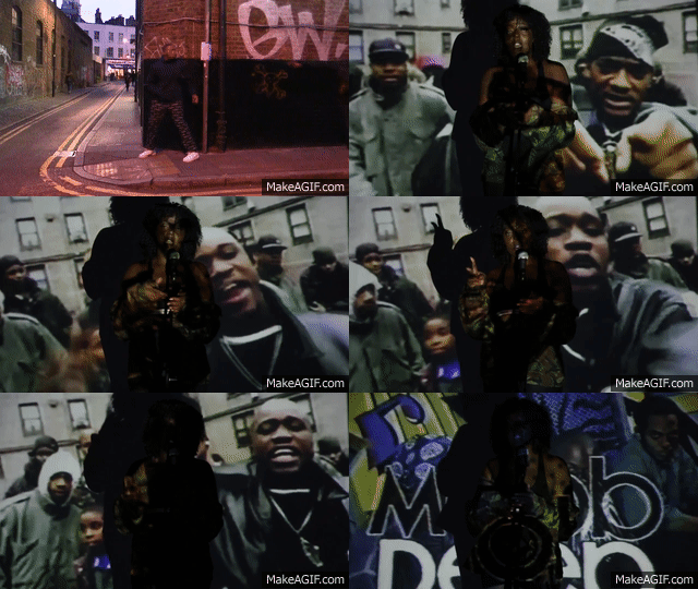
We definitely applied the conventions of music videos from Andrew Goodwin's theory by effectively showing an intertextual reference to Mobb Deep in order to relate the visuals of the song to the lyrics that reference the Mobb Deep album Shook Ones Part Two. This was shown through the long shot of Layla Obi singing the lyrics whilst having a projection of a Mobb Deep cypher projected onto her and the background behind her.
There was constant referencing to the lyrics throughout with our use of visuals. This is shown simply with the referencing towards fairy lights by visually showing the silhouette of Layla Obi dancing in front of fairy lights in the studio shots as well as the use of red and blue lights referencing a police siren and the visual image of flashing lights and strobe lights all visually expressed through our use of lighting in those studio shots.
Most music videos for mainstream R&B songs are hypersexualised with stories about love, relationships and breakups. An example of this is from the music video for 'No Substitute Love' by Estelle. Our video challenged the conventions of these, because firstly our artist is not just an R&B artist or a mainstream one at that, but rather has a modern, urban neo-soul sound as well.
Also there are music videos out there that do also have deep underlying political messaging about matters regarding black identity and police brutality on the black population, such as most famously Beyonce's recent music video 'Formation', which also was making a topical social point over the vulnerability of people with black ethnicity suffering from police brutality. The dream sequence in our video similarly connotes deep social messages with a black man running away from the police feeling that he has done something wrong even though there is no apparent evidence claiming he has, as that is the social conditioning prescribed on him as a young black man growing up in London. There even is a shot of him running away from policemen in the music video referencing the lyrics of the song to do with this sampled from the grime song 'Sirens' saying, "Don't you run when you hear the sirens coming".
There is much symbolism in our music video to connote messaging for feeling guilty and paranoid towards the police for no reason, this is shown most apparently through the quick change of shots between the black male in the male narrative and Layla Obi in the studio shots to show a physical representation for the lyrics 'blood on your hands but you don't know where it's from'. This fits right in with Simon Frith's way of thinking that a conceptual understanding of lyrics can be shown through the use of symbols to connote the lyrics. This one clip also embodies the performance aspects of the music video working alongside a clear narrative story for us to understand of the dream sequence in the male narrative of a young black man running away from his fears and from the police to eventually die after being shot by a shadow of his own imagination.
Website
In the presentation below, one can see research into the conventions of an artist's website as well as our fundamental website inspirations of certain artists and how we applied the conventions we saw into the structure, utility and presentation of our website. The presentation is split up into three main sections the functions of the website, the construction of an artist's brand image and the interactivity of the website.
Album Cover
Conclusion
of our genre for a female neo-soul/R&B artist. These genre conventions were followed to maximise our artist's appeal to our target audience. Although there was certainly a lot of creative experimentation with our artist for the creation of an image that would appeal to our young, urban target audience, who would want to see something new and fashionable.
Music Video
 |
| Mind map for Andrew Goodwin's music video theory |
There was constant referencing to the lyrics throughout with our use of visuals. This is shown simply with the referencing towards fairy lights by visually showing the silhouette of Layla Obi dancing in front of fairy lights in the studio shots as well as the use of red and blue lights referencing a police siren and the visual image of flashing lights and strobe lights all visually expressed through our use of lighting in those studio shots.
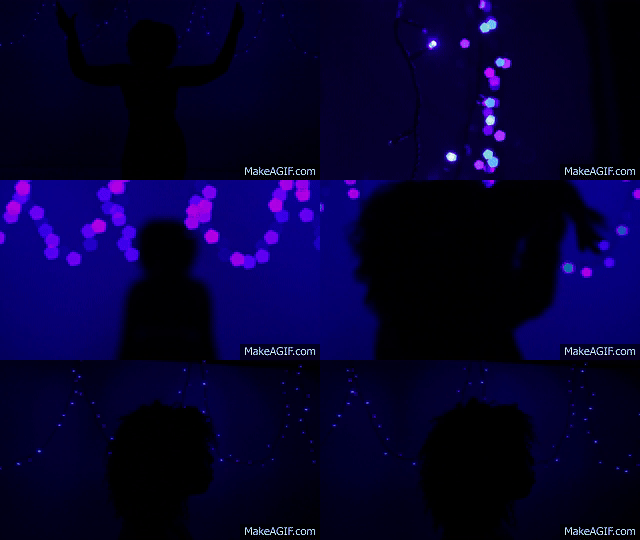 |
| Visuals referencing to 'fairy lights' image |
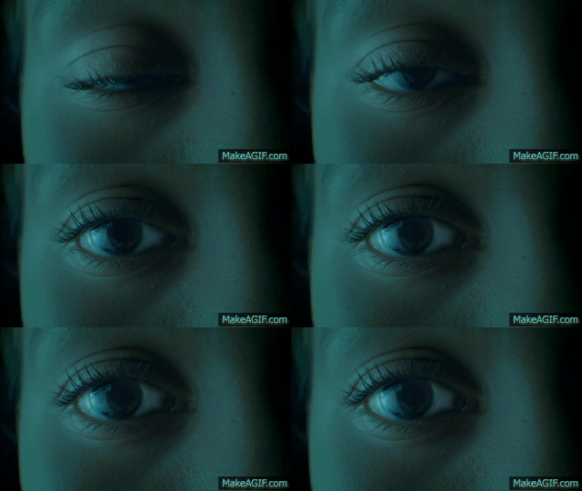
We took much inspiration from music videos in our genre, e.g. Seinabo Sey who is a young, British R&B singer. In her music video 'Hard Time' there is a striking eye opening close up, which seems very intimate and voyeuristic. We decided to copy this type of shot right at the start of the music video. Our voyeurism is not as simple as Goodwin's ideas of purely sexual voyeurism with close ups of dancing bodies synonymous with the mainstream music industry. However, our song is not being conventional with mainstream R&B, but instead has more of an artistic feel rather than getting the attention and appeal of that mainstream audience with shots of hypersexualised studio dancing.
However, the voyeurism in our music video did not just stop with our studio shots, but also translated through to our location shots for the male narrative. Our use of voyeurism, therefore, was not gender specific. The shots focusing on the eyes and perspective of our character in the male narrative were very much voyeuristic, as the audience was following him and his journey through London through a personal perspective. This is similar to the voyeuristic shots in the narrative from the London neo-soul song from the music video by NAO called 'Fool To Love'.
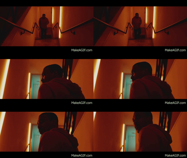 |
| Perspective voyeurism in the video for NAO 'Fool To Love' |
 |
| Voyeurism in the zoom out from eyes shot |
 |
| Mind map for Carol Vernallis' music video theory |
Certainly our male narrative dream sequence falls into Carol Vernallis' Theory, which supports the use of quick editing not being continuous and building atmosphere through more of a contextual depiction of the song's lyricism rather than a simple narrative editing. The narrative in this dream sequence is of a man running away from his own psyche and the fears he has towards the police in London. The narrative is, therefore edited discontinuously and shows the contextual ideas showing the damaged psyche of the young man in the male narrative through a variety of disorientating shots.
This is clearly shown through the pacey, discontinous build up of shots at the start of the dream sequence, which even foreshadows the future ending of the dream, which is him being shot by a shadow of his own imagination.This shot itself of the shadow shooting was heavily influenced from the Jaden Smith video 'Scarface', who I think would also fit into our target audience, as a fashionable young rapper with a very modern sound with influence from neo-soul/R&B music as well as more urban music such as trap and hip-hop similarly our song had influence from the London urban music genre grime as well as neo-soul and R&B. Also the music video 'Scarface' had a narrative of a young man travelling around a city with a discontinuous montage of these travelling shots.
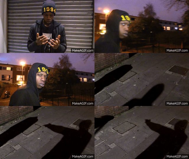 |
| Shadow death at the end of the dream sequence |
 |
| Non Linear quick pacey start to the dream sequence |
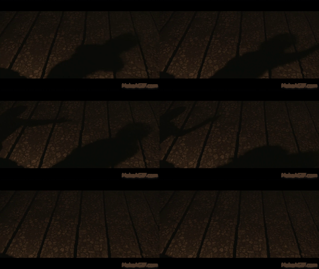 |
| Jaden Smith 'Scarface' shadow death idea |
 |
| Mind map for Simon Frith's music video theory |
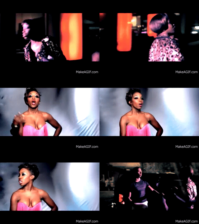 |
| Conventional R&B music video with sexual voyeurism and a love story narrative in video for 'No Substitute Love' by Estelle |
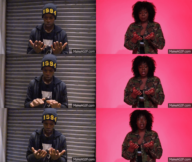 |
| Conceptually representing lyrics of the song for 'blood on hands' lyrics |
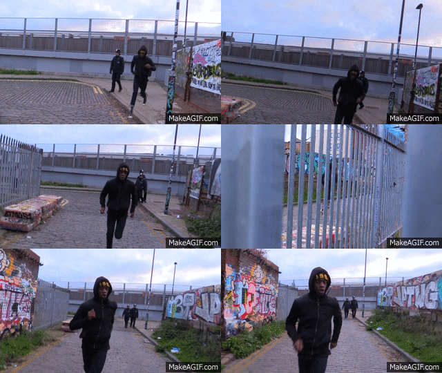 |
| Running away from police |
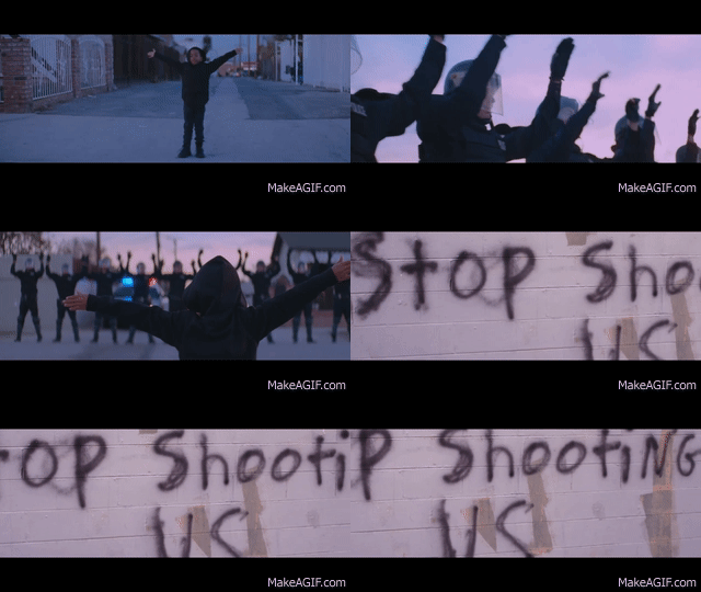 |
| Aforementioned political message from Beyonce's 'Formation' music video |
In the presentation below, one can see research into the conventions of an artist's website as well as our fundamental website inspirations of certain artists and how we applied the conventions we saw into the structure, utility and presentation of our website. The presentation is split up into three main sections the functions of the website, the construction of an artist's brand image and the interactivity of the website.
Album Cover
Below is a 'Padlet' showing information for our inspirations and conventions followed for the creation of our album cover.
Conclusion
Overall our group has created various media products that do use, challenge and develop forms and conventions used for the construction of a music artist's music video, website and album cover. We did subtly change certain conventions in order to make our artist stand out a bit to make these media texts seem more interesting and appealing to Layla Obi's young and trendy target audience. However, it is difficult to claim that we did challenge many genre conventions, as the genre itself of the song 'Blue Lights' is open to interpretation and despite having certain R&B influences, it is certainly not from the mainstream R&B genre.
Labels:
A2 Evaluation
Evaluation Q2: How effective is the combination of your main product and ancillary texts?
Our main product and ancillary text were made with the idea that they would both be used fluidly together to promote the brand of Layla Obi in a synergistic way in order for the product of Layla Obi and her music to appeal and be sold to our target audience. In order to do so, therefore, the artist's image and visual motifs must repeat throughout the media products.
An example we had of an effective preexisting synergistic campaign was that from the artist Ella Eyre, who was also a young adult, female Londoner with a similar sound to her London singing voice and also has an unclear genre of music with certain inspirations from Neo-soul and R&B present throughout her music.
There were purchasing oppurtunities in which the artist can be seen as a commodity with fans able to spend money on merchandise associated with Layla Obi. As well as this, the idea that the products of the artist make her seem more attainable, there still is the distance fans will have with the artist of Layla Obi, that one will very likely never be able to obtain her or meet her, but will try getting closer to the artist by consuming merchandise associated with Layla Obi.
The persona of Layla Obi is enhanced through avocation of the London urban scene shown through the continual usage of a graffiti aesthetic. The subject matter of the music video for 'Blue Lights' shows an avocation for the 'Black Lives Matter' ethos as well as the #BLM appearing in the inside album cover.
The relatable human aspect of the character of Layla Obi is shown on the website which gives information through use of the Q and A for the artist as well as a 15 second video of the artist on the website which fans can watch as well as reading the small biography about the artist's humble beginnings and personality. However, the fierceness of Layla Obi's personality as well as her voice are aspirational qualities of the artist that fans can idolise. Layla Obi was made relatable for her audience even more through photos of her wearing streetwear brands such as Adidas and Nike rather than expensive brands such as Chanel or Givenchy.
Connectivity through the Website
Below is a Padlet giving information about the purchasing options and the use of the website as Cross-media platform. I feel evidence was necessary to show that there was certainly connectivity on the website for Layla Obi. As well as the website being fully interactive, it offers purchasing options and cross-media platforms allowing for fans to be immersed and connect with the artist Layla Obi.
The inventor of the World Wide Web Tim Berners-Lee described the web as "a collaborative medium, a place where we could all meet and read and write." It is clear that the collaborative aspect of the web is certainly present through the immersive and interactive elements of the website itself. However, it is clear that our website is as Time O'Reilly would call a 'Web 2.0' website, which allows users to collaborate with each other in a virtual community where one can follow, like and comment on the social networking sites that Layla Obi is present on as well as joining the mailing list on the website.
This idea was further built on in more detail by Andrew Dubber who wrote in his book 'Toward a Sixth Media Age' about the new utility of web 2.0 music websites. I agree with his point that nowadays a music website is a place where people can connect easily with the artist as well as with each other. I feel that through use of social networking sites it is now simple people to connect with each other through being part of an online community under an artist's name, as in all being able to follow their social media pages and be able to like, comment or share the artist's content on their social media pages. One can comment on an artist's music video from YouTube that is placed on the website, one can buy merchandise, listen to the artist's music and join the mailing list for the Layla Obi website, meaning that they become part of the artist's website community where they can find more news about the artist straight from the website in which they can also interact with.
Conclusion
An example we had of an effective preexisting synergistic campaign was that from the artist Ella Eyre, who was also a young adult, female Londoner with a similar sound to her London singing voice and also has an unclear genre of music with certain inspirations from Neo-soul and R&B present throughout her music.
As you can see from the examples above, the website ultimately acted as the hub holding all artist information. However, the other media products, i.e. the music video and the album cover, also work synergistically with the website or the synergistic aesthetic associated with the artist. There is in fact a link to the artist's website on the back of the album cover. Parts of the music video for 'Blue Lights' and certain unused shots from the shooting of that music video play in the background for the website. The graffiti aesthetic is also a prominent feature in the male narrative in the video for 'Blue Lights' as well as featuring on the artist's social networking pages, the Layla Obi website and the album cover aesthetic. The relationship, therefore, is not only about the synergy the website has with other platforms, but in reality all products work with a fluid synergistic relationship with each other in making sure information about Layla Obi and the artist's aesthetic is present throughout all platforms.
Richard Dyer's Star Theory
There were purchasing oppurtunities in which the artist can be seen as a commodity with fans able to spend money on merchandise associated with Layla Obi. As well as this, the idea that the products of the artist make her seem more attainable, there still is the distance fans will have with the artist of Layla Obi, that one will very likely never be able to obtain her or meet her, but will try getting closer to the artist by consuming merchandise associated with Layla Obi.
 |
| Merchandise that can be bought to get closer to the artist |
 |
| Graffiti in photo on social media page |
 |
| Graffiti on album cover |
The relatable human aspect of the character of Layla Obi is shown on the website which gives information through use of the Q and A for the artist as well as a 15 second video of the artist on the website which fans can watch as well as reading the small biography about the artist's humble beginnings and personality. However, the fierceness of Layla Obi's personality as well as her voice are aspirational qualities of the artist that fans can idolise. Layla Obi was made relatable for her audience even more through photos of her wearing streetwear brands such as Adidas and Nike rather than expensive brands such as Chanel or Givenchy.
 |
| A gallery photo of Layla Obi wearing an Adidas jacket |
 |
| The artist bio and page about her |
Connectivity through the Website
Below is a Padlet giving information about the purchasing options and the use of the website as Cross-media platform. I feel evidence was necessary to show that there was certainly connectivity on the website for Layla Obi. As well as the website being fully interactive, it offers purchasing options and cross-media platforms allowing for fans to be immersed and connect with the artist Layla Obi.
The inventor of the World Wide Web Tim Berners-Lee described the web as "a collaborative medium, a place where we could all meet and read and write." It is clear that the collaborative aspect of the web is certainly present through the immersive and interactive elements of the website itself. However, it is clear that our website is as Time O'Reilly would call a 'Web 2.0' website, which allows users to collaborate with each other in a virtual community where one can follow, like and comment on the social networking sites that Layla Obi is present on as well as joining the mailing list on the website.
This idea was further built on in more detail by Andrew Dubber who wrote in his book 'Toward a Sixth Media Age' about the new utility of web 2.0 music websites. I agree with his point that nowadays a music website is a place where people can connect easily with the artist as well as with each other. I feel that through use of social networking sites it is now simple people to connect with each other through being part of an online community under an artist's name, as in all being able to follow their social media pages and be able to like, comment or share the artist's content on their social media pages. One can comment on an artist's music video from YouTube that is placed on the website, one can buy merchandise, listen to the artist's music and join the mailing list for the Layla Obi website, meaning that they become part of the artist's website community where they can find more news about the artist straight from the website in which they can also interact with.
Conclusion
In our project, I feel we successfully combined our main product and ancillary texts, which worked efficiently together to promote Layla Obi as an artist. Layla Obi will appeal as a relatable London artist with certain aspirational qualities. She is a product of her time and her humble urban environment, but due to her aspirational characteristics such as her voice and the way in which her style romanticizes the urban scene of London makes her reach the status of an idol and a role model to fans. There is clearly a synergistic relationship between all media products connecting together to work harmoniously in order to make sure that information about Layla Obi and the artist's aesthetic with her image is present throughout all platforms, thus allowing her to consistently appeal to her target audience through the repetition of these factors of her image .
Labels:
A2 Evaluation
Evaluation Q3: What have you learnt from your audience feedback?
Uses & Gratifications
Blumler and Katz expanded and created the theory we know as gratifications theory. They realised that uses and gratifications have been expanded due to the new use of technology to increase interactivity and immersion through mainly the internet.
Application of the theory for Layla Obi:
Surveillance
We used information on the website such as a news section and a Q&A with the artist. As well as this people could join a mailing list for more artist news and could find links to her social media pages and gig dates and times.
 |
| Tour information |
 |
| The artist Q&A |
 |
| The mailing list for the website |
Diversion
Our target audience could be immersed in an interestingly shot and edited music video with fast, quick transitions in a male narrative of a dream sequence and sleek studio shooting of the artist Layla Obi herself.
 |
| The pacey surreal dream sequence footage |
The audience could learn about the artist through their personal interaction through fans from the social media pages for the artist, such as Twitter, where she spreads her own beliefs and ideologies for fans to be attracted by and interact with. This platform also allows for the audience to interact with the artist personally.
 |
| The twitter page for Layla Obi |
The audience can relate to Layla Obi as a trendy London teenager and, therefore, relate to her because of that. This factor allows for her to appeal to her target audience. The audience can watch her 15 second video on the website, as well as reading her bio on her page, see her gallery, read her Q &A, go on their social networking sites and watch the messaging in her music video in order to get a greater understanding of who she is as a person, aspire to be her as she is a role model for a young independant woman and relate to her normal personality.
 |
| 15 second video with Layla Obi |
 |
| The Bio page for Layla Obi |
Our Feedback Given to us During Construction
Before collecting our audience feedback for evaluation, we had gained experience from collecting feedback from teachers and members of our TA during the creation of our music video and after the creation of the rough cut for our music video. The fundamental parts of the feedback we received for this were that the male narrative was difficult to follow and that the shots that were filmed were too boring and should have been more pacey, interesting and disorientating to engage with the audience more and create a more professional looking media product. We were told that our first shot was too boring in the male narrative and that our projection shots were too dark and were not lit properly, so that the audience could see the face of Layla Obi miming the lyrics. There also needed to be a clearer relationship between the studio shots and the male narrative.
 |
| The rough cut establishing scene that was unsuccessful |
 |
| New, more interesting shots included in our music video creating a link between studio and narrative shots |
 |
| A projection shot that was too dark |
The data collected for our evaluative survey for our music video was from using the website survey monkey as well as my own personal interviews with people asking them questions about their feelings towards the website and album cover.
Survey Monkey
Through the online utility of a survey website, the group created a survey with questions about, who was watching the music video and their thoughts towards the artist and music video for 'Blue Lights'.
The questions in the survey were:
- What is your age?
- What is your gender?
- What type of music do you listen to?
- What genre do you think this music video is fro? What made you think this?
- Who do you think its target at?
- Who do you identify the artist in the music video with and explain the type of artist you think they might be?
- Describe what happens in the video
- Does the music work well to promote the artist and the song?
- Do you want to find out more about the artist, having watched the video?
- What do is the theme or message of this music?

90.91% of those doing the survey fit into our target audience of 16-25 year olds the remaining percentage put themselves as 'other'. This was good, as the majority fitted into our TA and so we could see what our TA would think about the media product we wanted them to consume.
The split in gender was almost equal, so we could get a firm idea over what both genders would have thought about our media product. It was no surprise that there was 10% more women taking the survey, as our artist was female and so her TA would most likely be comprised slightly more of women due to her being an aspirational female role model.
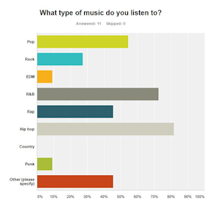
The majority of our survey said they were fans of Hip Hop, so hopefully hip hop fans would take delight in seeing the intertextual reference of Mobb Deep in our music video, was my initial thought. Over 70% of those taking the survey said they were fans of R&B music. I, therefore, think that the tastes of those taking the survey would fit into our TA. This is because the young, trendy youth of today tend to have an eclectic taste of music, but primarily fans of our artist would most likely be fans of the R&B genre in which our artist most aligns to with her music.
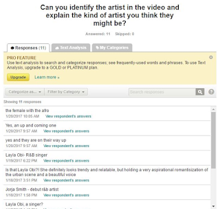
It was reassuring to see that those taking the survey could identify the R&B genre of the music video with some even seeing the soulful elements of the genre itself, which is technically neo-soul/R&B. This shows that we were able to appeal to our desired target audience of neo-soul/R&B fans.
We could see that the artist was successfully conveyed as a young, up-incoming R&B artist, who was releasing her debut album.
Perhaps the most encouraging aspect of the survey questioning was the fact that nearly all those taking the survey could clearly identify the narrative story and exactly what was taking place in the music video. This was very pleasing to see, as we were told initially during feedback in our construction that the narrative story was hard to follow in our rough cut for the music video.
We could see from the answers to this question that the music video was very successful in promoting both the artist and the song. Only one person said that it couldn't promote the artist that clearly.
Yet again, all but one anomaly claimed that they would want to find out more and here more of the artist music in the future. I felt this one negative comment was most likely due to someone not being a fan of the music genre or simply someone 'trolling' the survey.
All but two taking the survey could identify the police related political messaging in the music video, which was very encouraging to see. This shows that we could successfully appeal the artist's identity through Uses and Gratification's theory of the need to display ideologies and beliefs of the artist to let them appeal to their target audience.
My personal feedback I obtained
In order to have a more well rounded view of the appeal of the artist through their website and album cover media products to our target audience, I had devised some questions to 2 teenage girls and 3 teenage boys, who were all Londoners that claimed they were fans of R&B music. I've coloured the girl's feedback in pink and the boy's feedback in blue. I was pleased with the positive comments I got from the five of them when I asked them about their views towards the website and album cover that you can see below:
What do you think about the website?
- Wow it looks really professional!
- I love the video background.
- It works really well as a hub of information.
- The Q&A and 15 second video are really good for knowing more about what the artist is about.
- It's really good, but the merchandise is a bit boring.
What are your views towards the album cover?
- The graffiti looks really nice and urban.
- The tracklist seems legitimate.
- I think the front and back cover is impressive, but I'm not sure if it relates well with the inside cover design.
- I like the colour scheme it makes Layla Obi stand out.
- I love the album name and she looks cool.
The feedback from the questions showed to me that gender had no bearing on the positive feedback we received for both our website and the album cover for 'London Colour'. I was especially pleased with comments on the website praising the interactive, immersive nature of the videos and content. As well as the comment that the website was a hub of information. This showed that the website successfully worked as a cross-media platform.
Conclusion
Myself and my group have learn a lot from our audience feedback. It first let us know changes we had to make to the creation of a successful music video media product. It helped us know that our product appealed to our target audience. It seems our product was very much successful in appealing to our target audience, which comprised of both sexes, who in the most part were fans of the R&B genre. I am pleased with the positive feedback received as I am now clear that it helped us manage to appeal to our target audience and, therefore, have created successful media products.
Labels:
A2 Evaluation
Evaluation Q4: How did you use new media technologies in the construction and research, planning and evaluation stages?
There has been a great proliferation of new media technologies due to the expansion of Web 2.0. David Gauntlett believe Web 2.0 is a faster, more collaborative platform that leads to an audience shirt from passive consumers to active 'prosumers', as it is more connective due to its collaborative nature. New technologies were vital throughout this process and you can see below how vital they were during research, planning, construction and evaluation stages of this project.
Research
Below is a Padlet showing the useful online resources I used on web 2.0 to draw inspiration for the desired aesthetic I wanted to achieve for the creation of the artist Layla Obi.
Planning
The slides below show and explain the technologies that were used for the planning stage.
Neither 'Whatsapp' nor 'Blogger' were new technologies for me, as a teenager I use 'Whatsapp' all the time, especially for group chats with other teenagers, so it was a useful platform in which everyone was accustomed to in the group. As a media student I am also used to using 'Blogger' to keep my projects organised and make sure I have reference points to refer back to for planning different media projects.
Above is a stealomatic that was created through the use of Adobe Premier Pro, a YouTube to MP3 converter, and youtube research into inspirational music videos. It created a platform in which we could follow to create structure for our shootboard and, therefore have a clearer understanding of the aesthetic and shots we were trying to achieve for our music video for 'Blue Lights'. It felt like quite some time ago to the first stealomatic I had created and so I had to re learn how to create an effective stealomatic in order to show our desired shots to the timings of the song we had envisioned them to go. The stealomatic became very useful for seeing what shot ideas worked well for the video and how the storyboard, shootboard and music video should be structured.
Construction
Below is a Prezi explaining how and why we used certain technologies in the construction (production) stage.
Below is a Prezi explaining how and why we used certain technologies in the construction (Post-Production) stage.
I think perhaps my greatest learning curve for technology during this project was in post production learning how to use Photoshop effectively. Due to the fact that I had never used Photoshop before, I made sure to watch videos on Youtube to learn how to use it properly to create desired effects such as the use of the mirroring tool as well as seeking the skilled help of the media technician over certain queries. Overall, I feel very pleased that I have been able to gain this technological skill over the course of post production, as I am proud with how the album cover turned out, and I feel it will be a useful skill for other media projects in the future.
Evaluation
The webtools below were all useful for the creation of informative, concise and interactive posts on the blog for my evaluation. They were useful in order to present my points in an interesting manner combining different evidence together such as videos, gifs and images.
Prezi
Prezi was very useful for creating smooth, eye-catching presentations with nice themes and animations. This allowed me to display information easily and present it well. One of the only problems with Prezi was that it did not support the use of Gifs.
Google Slides
Google slides was another tool that was very handy for creating simple presentations that could be embedded onto the blog. I felt it was even easier to use than Prezi.
Padlet
Padlet was a very useful tool for showing information and evidence during the evaluation stage. It could display a lot of content in one condensed frame, preventing posts becoming too lengthy.
Makeagif
This service was very simple to use when it was working. I could import specific YouTube segments from clips to show evidence or inspiration on the blog.
Mindmeister
Mindmeister was a useful platform to brainstorm ideas. I used it for Evaluation Q1 to brainstorm three theorists that were inspirational for decisions made in the construction of our media product and the conventions that the media products followed.
Survey Monkey
Conclusion
To make efficient progress during research and planning, construction, and evaluation stages. My knowledge for using webtools and new media technologies has greatly increased.There has been a great proliferation of media technologies in the digital age of the past decade due to the expansion of Web 2.0. I feel that through utilising webtools and technologies we have been able to greatly increase the quality of the media products we have produced.
Research
Below is a Padlet showing the useful online resources I used on web 2.0 to draw inspiration for the desired aesthetic I wanted to achieve for the creation of the artist Layla Obi.
Planning
The slides below show and explain the technologies that were used for the planning stage.
Neither 'Whatsapp' nor 'Blogger' were new technologies for me, as a teenager I use 'Whatsapp' all the time, especially for group chats with other teenagers, so it was a useful platform in which everyone was accustomed to in the group. As a media student I am also used to using 'Blogger' to keep my projects organised and make sure I have reference points to refer back to for planning different media projects.
Above is a stealomatic that was created through the use of Adobe Premier Pro, a YouTube to MP3 converter, and youtube research into inspirational music videos. It created a platform in which we could follow to create structure for our shootboard and, therefore have a clearer understanding of the aesthetic and shots we were trying to achieve for our music video for 'Blue Lights'. It felt like quite some time ago to the first stealomatic I had created and so I had to re learn how to create an effective stealomatic in order to show our desired shots to the timings of the song we had envisioned them to go. The stealomatic became very useful for seeing what shot ideas worked well for the video and how the storyboard, shootboard and music video should be structured.
Construction
Below is a Prezi explaining how and why we used certain technologies in the construction (production) stage.
Below is a Prezi explaining how and why we used certain technologies in the construction (Post-Production) stage.
I think perhaps my greatest learning curve for technology during this project was in post production learning how to use Photoshop effectively. Due to the fact that I had never used Photoshop before, I made sure to watch videos on Youtube to learn how to use it properly to create desired effects such as the use of the mirroring tool as well as seeking the skilled help of the media technician over certain queries. Overall, I feel very pleased that I have been able to gain this technological skill over the course of post production, as I am proud with how the album cover turned out, and I feel it will be a useful skill for other media projects in the future.
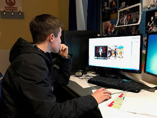 |
| Me editing the album cover on Adobe Photoshop |
Evaluation
The webtools below were all useful for the creation of informative, concise and interactive posts on the blog for my evaluation. They were useful in order to present my points in an interesting manner combining different evidence together such as videos, gifs and images.
Prezi
Prezi was very useful for creating smooth, eye-catching presentations with nice themes and animations. This allowed me to display information easily and present it well. One of the only problems with Prezi was that it did not support the use of Gifs.
 |
| The Prezi presentations made for the Evaluation |
Google slides was another tool that was very handy for creating simple presentations that could be embedded onto the blog. I felt it was even easier to use than Prezi.
Padlet
 |
| Padlet documents created for Evaluation Questions |
This service was very simple to use when it was working. I could import specific YouTube segments from clips to show evidence or inspiration on the blog.
Mindmeister
Mindmeister was a useful platform to brainstorm ideas. I used it for Evaluation Q1 to brainstorm three theorists that were inspirational for decisions made in the construction of our media product and the conventions that the media products followed.
Survey Monkey
This online platform was vital for Evaluation Q3 in order to obtain feedback from our target audience that we could analyse and so judge the success of our media products. It gave anonymous answers to questions we had set the public over our music video and artist, so that we could judge if our media products could appeal to our target audience. The only problem with Survey Monkey was that we could only be limited to using nine questions.
Conclusion
To make efficient progress during research and planning, construction, and evaluation stages. My knowledge for using webtools and new media technologies has greatly increased.There has been a great proliferation of media technologies in the digital age of the past decade due to the expansion of Web 2.0. I feel that through utilising webtools and technologies we have been able to greatly increase the quality of the media products we have produced.
Labels:
A2 Evaluation
Subscribe to:
Posts (Atom)

